The 2026 FX Playbook: Which Currencies Look Undervalued or Overvalued?

Read Time: 3-4 minutes
Valuation in FX doesn’t always come from complicated models. Sometimes the most honest signals come from the charts themselves. Long-term ranges, multi-year support zones, stretched cycles, and price behaviour around extremes can tell you more about a currency’s “true” value than a spreadsheet ever could. With 2025 almost wrapped up, the major pairs are giving a clear picture of which currencies look cheap heading into 2026 and which ones might be running out of room.
The best part is that you don’t need PPP, REER or fair-value formulas to see it. Charts can reveal it immediately.
- AUD looks cheap based on long-term structure
- NZD sits in the same "cheap but steady" category
- JPY remains the standout undervalued major
- The USD still looks stretched, but not in a dramatic way
- Putting the 2026 valuation picture together
When you zoom out on a weekly AUDUSD chart, the Aussie has spent most of the last few years pressed into the lower end of its long-term range.
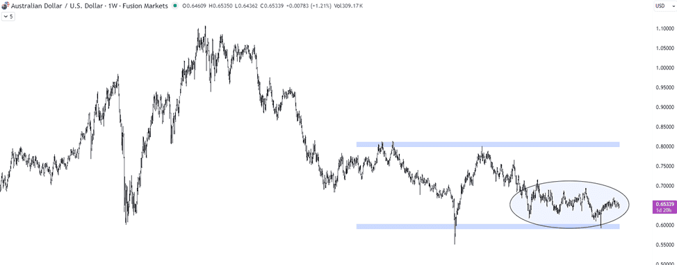
AUDUSD – Weekly Chart
Every attempt to break lower into the 0.62–0.64 pocket has found buyers, and those levels have acted like a structural floor going back more than a decade. Even with Australia’s softer data patches, China’s uneven recovery and choppy commodity prices, the currency hasn’t made new long-term lows.
That type of behaviour usually suggests undervaluation rather than weakness. Markets tend to punish currencies that are genuinely fragile, and AUD hasn’t traded like one.
NZDUSD has tracked a similar path. Across 2023-2025, the pair held a sequence of higher lows and refused to break the structural support zone that cushioned it through the last two global slowdowns.
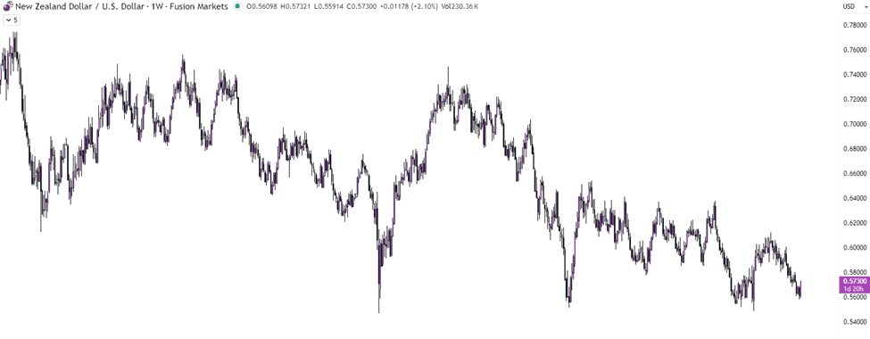
NZDUSD – Weekly Chart
Even with the RBNZ taking a cautious stance and inflation staying stickier than hoped, NZD continued to respect the bottom of its multi-year range.
Looking at the technicals, the chart almost looks like a compression coil: price is pinned near the base, but buyers appear whenever it dips. That’s usually what “undervalued” looks like when you rely on raw price action rather than valuation formulas.
USDJPY is still sitting near levels last seen in the early 1990s, and the chart tells the story better than any model.
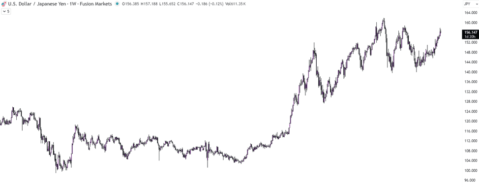
USDJPY – Weekly Chart
The pair has reached the top of a multi-decade range, hammered higher by wide yield differentials and the BOJ’s slow approach to normalising policy. But the monthly chart now shows a market struggling to make meaningful new highs.
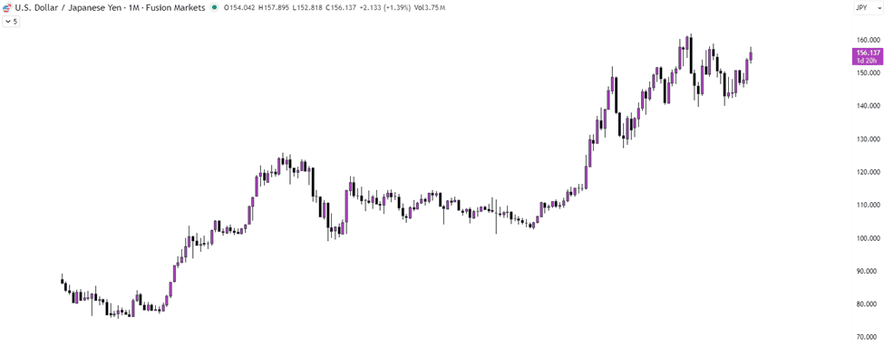
USDJPY – Monthly Chart
Momentum has flattened, candles have become more hesitant, and traders are starting to wonder whether the yen’s long period of underperformance is finally running its course.
When a currency taps long-term resistance that has held for more than thirty years, the risk-reward balance naturally shifts. The yen still has policy headwinds, but the price structure alone places it firmly in the undervalued camp.
The dollar spent the second-half of 2025 grinding sideways rather than trending, but it’s definitely not at the top of it’s long-term range anymore.
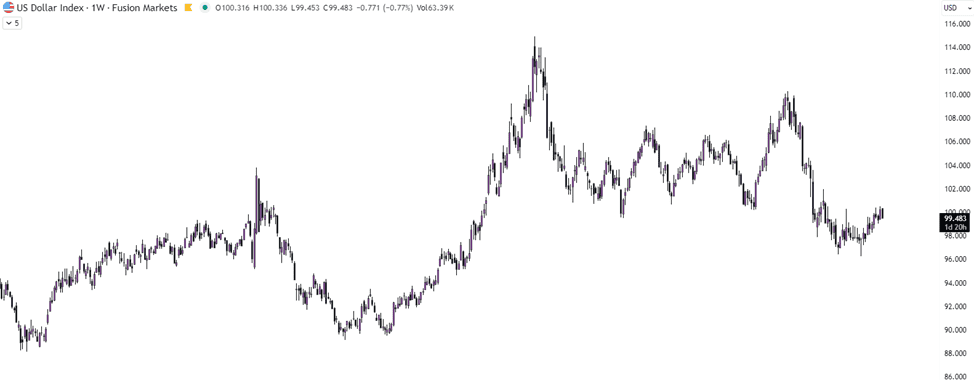
USDX (US Dollar Index) – Weekly Chart
It’s given back a significant amount of the 2022 rally and is now sitting closer to the middle of its long-term structure. On a weekly chart, the dollar keeps stalling at progressively lower highs, with the 107-110 region acting as a ceiling for nearly two years. At current levels around 99, the USD isn’t “expensive” by price behaviour alone – but it’s also not cheap. It’s neutral, sitting in the middle of the broader range, and waiting for the next macro catalyst to set the direction for 2026.
CHF sits at the richer end of its range too
The Swiss franc enjoyed steady safe-haven demand through 2025, particularly during the wobble in global risk sentiment mid-year. But when you pull up EURCHF or USDCHF on a weekly chart, the franc appears firmly at the strong end of its historical structure.
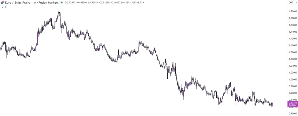
EURCHF – Weekly Chart
Every time EURCHF dips into the 0.94-0.95 zone, it finds resistance from the SNB or from broader market dynamics.
That type of persistent CHF strength often marks a currency as “rich,” even if fundamentals haven’t dramatically shifted.
If you rely purely on price action rather than economic models, the valuation map for 2026 becomes surprisingly straightforward.
Currencies that look undervalued based on long-term structure include AUD, NZD and JPY. All three trade near multi-year or multi-decade floors, showing consistent buying interest at key levels.
Currencies that look expensive relative to their long-term ranges include USD and CHF. Neither looks fragile, but both appear stretched compared with where they normally trade over a full cycle.
EUR and GBP sit in the middle, neither cheap nor rich, waiting for clearer macro catalysts to emerge.
The broader message is that long-term price behaviour still matters. When currencies press into extremes, the market usually tells you before the macro story does.
For 2026, the most interesting opportunities may come from those currencies that have held their ground quietly at the bottom of their structures, waiting for a shift in global conditions.
We’ll never share your email with third-parties. Opt-out anytime.